
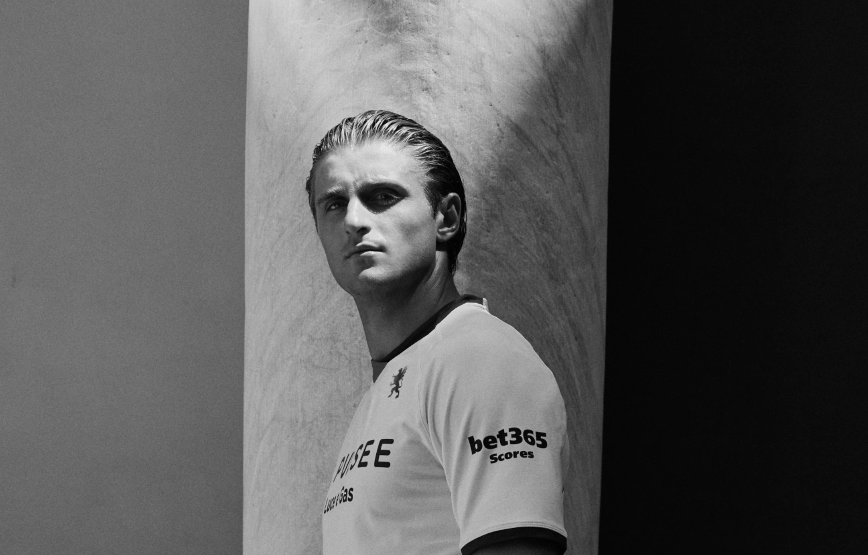
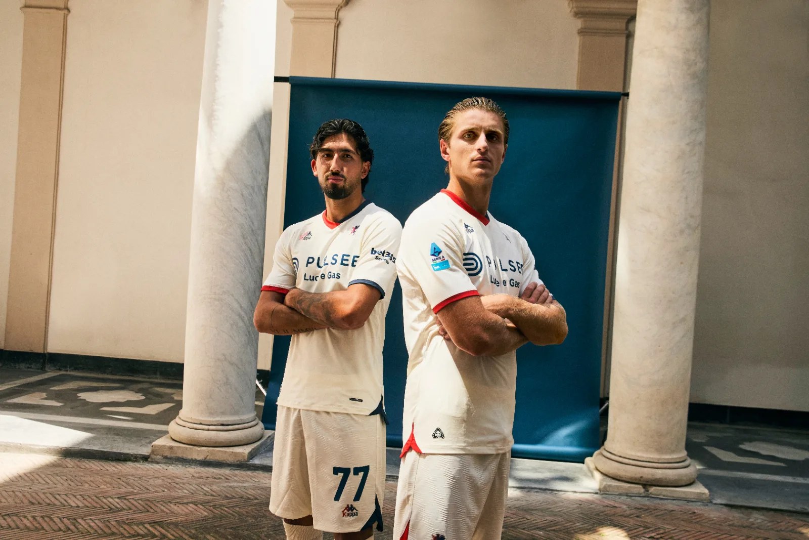
The easy version of this kit would have been a bright white shirt with a heritage crest and a line about the founders. Genoa have done something harder. The white on the 2026/27 away shirt is rendered in sepia, the off-white of a photograph that has been sitting in an archive for a century.
A cleaner white would have looked sharper on a shop floor and sold more easily online. The sepia is the decision that makes the rest of the shirt mean anything, and it is the one that cost them something.
The White Was Never Just White
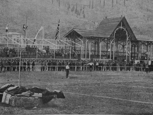
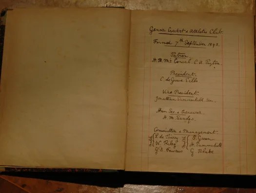
Genoa was founded on 7 September 1893 as the Genoa Cricket and Athletic Club, by British residents of the city. It was a club for Englishmen abroad, and for its first years Italians were not permitted to join.
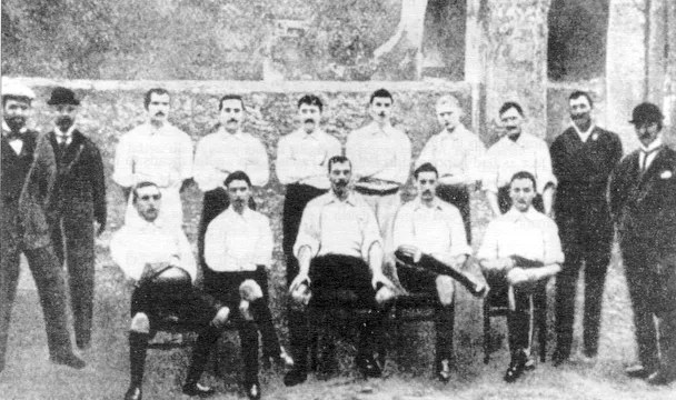
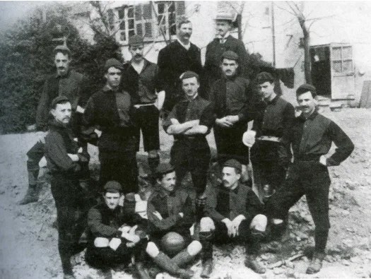
The shirts were white because England played in white. That is the whole point of the original kit and it is the detail most retellings leave out. A group of English expatriates in an Italian port, wearing their national team's colours, in a city that had spent five hundred years absorbing foreigners and their money.
Football was not the first thing they played. Cricket and athletics came first, and association football was added later, in 1897. The name Genoa Cricket and Football Club survives as the record of that order of events, which is why a campaign about origins can point at cricket without inventing anything.
The Colors Arrived Slowly
The red and blue did not replace the white in one move, and this matters for reading the shirt.
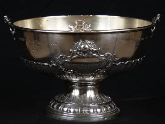
Genoa first went to white and blue vertical stripes around the turn of the century, and the red and navy halves that everyone now recognises arrived in 1901. Three shirts in eight years, from a club that had just won the first Italian championship in 1898 and would win two more by 1900.
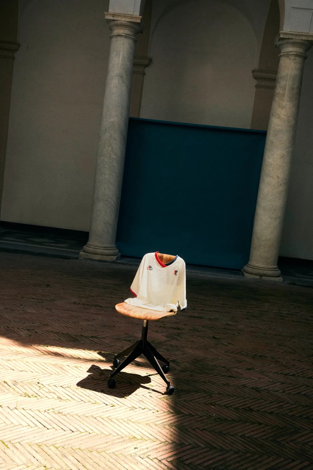
Which makes the design on the new away kit closer to a record than a metaphor. Red sits on the left, blue on the right, and rather than meeting in a hard line the two blend across the chest and the back of the collar. The club's present colors emerge out of the historic white instead of being printed on top of it.
That is more or less what happened.
Inside the back of the collar, 1893 is stitched in.

Palazzo Rosso, Palazzo Bianco
The campaign was shot at the Musei di Strada Nuova, between Palazzo Rosso and Palazzo Bianco.
Strada Nuova, now Via Garibaldi, is a street of sixteenth century palaces built for Genoa's merchant families at the height of the republic's wealth. The two buildings the shoot sits between are named for the colours red and white.
A red palace and a white palace, and a shirt that moves between white, red and blue. Nobody needs it explained, which is the mark of the choice being made by someone who understood the brief.
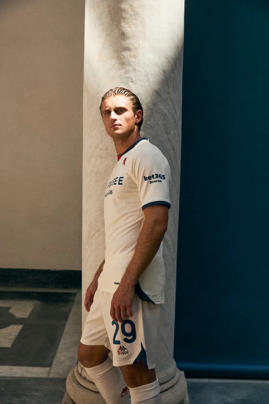
It also puts the kit in front of the version of Genoa the founders would have arrived into. A port city with money, foreign business, and a long habit of letting outsiders in provided they were useful.
The Read
Most retro kits copy an old design and let nostalgia carry the rest. This one is closer to a restoration. The color is aged rather than reproduced, the modern palette is introduced as something that happened to the shirt over time, and the founding year is placed where only the person wearing it can see it.
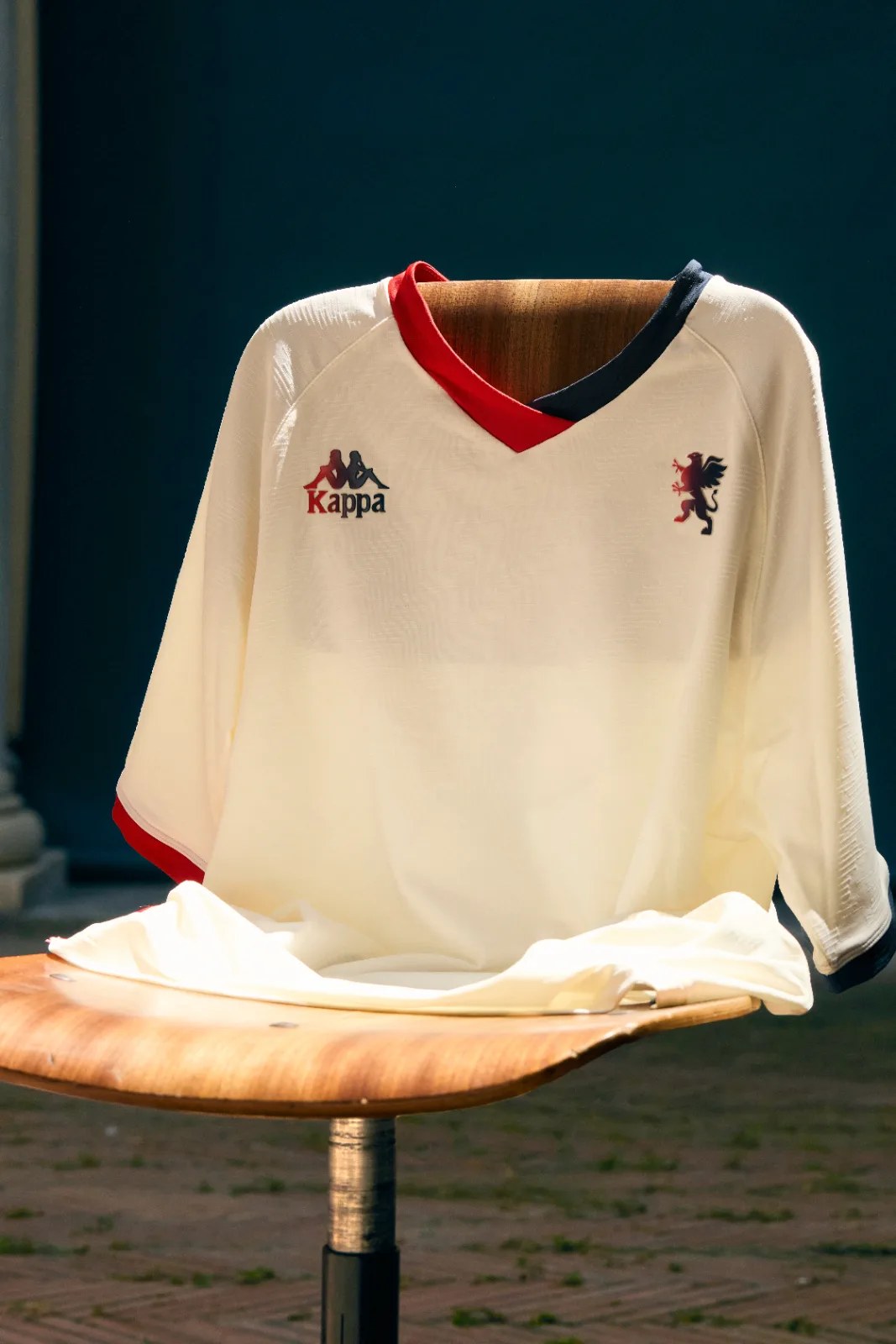
That last decision is the one worth noting. A club selling its history would have put 1893 on the chest.
There is a larger thing sitting underneath all of this. Retro kits have become a growth category across European football, and they are most valuable to clubs like this. Because age is the one asset that cannot be bought quickly or at any price. A newly funded club can sign anyone. It cannot buy heritage.
So the shirt is not nostalgia standing in for ambition. In a league where money now moves faster than anything else, it is the only thing on the balance sheet that nobody else can acquire.
For one season, Genoa are choosing to wear it.