
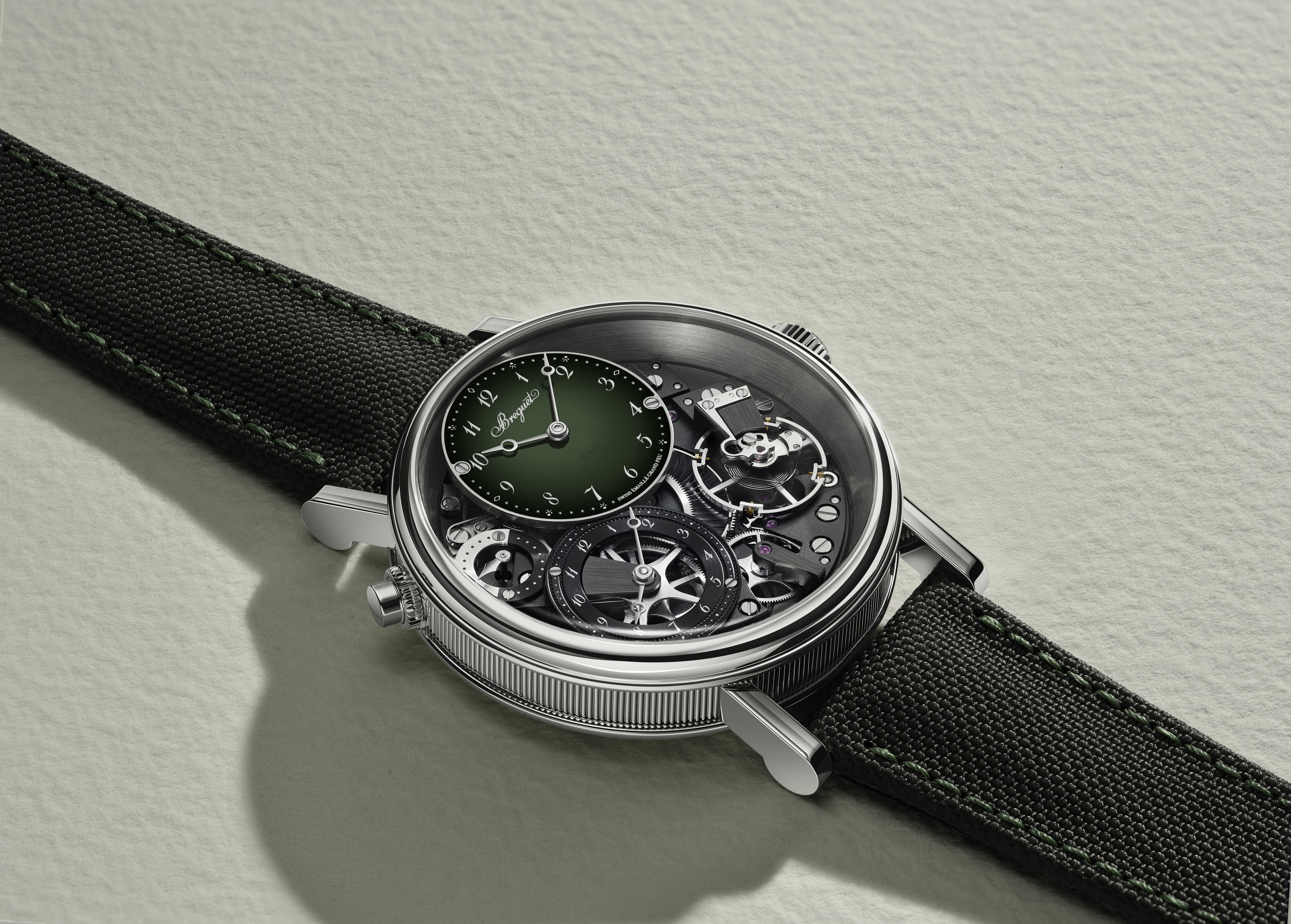
Breguet's Tradition collection turns 21 this year. The new references prove it's just getting started.
The great contrast of watchmaking is that the most impressive part is often the one you rarely see. The movement lives on the back, under a case, out of sight. The dial is a face. A cover. The performance happens behind it.
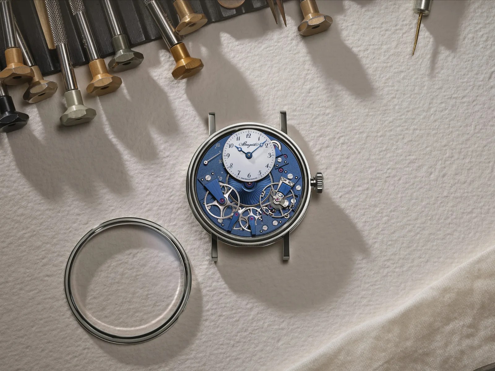
The Tradition collection, launched in 2005, was built on the opposite idea. Invert the calibre. Put the movement where the dial is. Let the mechanics be the display. It was a radical idea dressed in restraint, and it worked because it wasn't a gimmick. It came from a place of genuine conviction about what a watch is for.
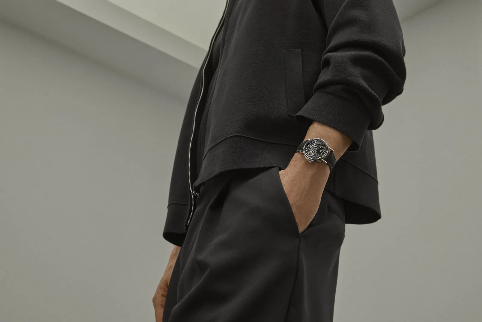
Twenty-one years later, Breguet is revisiting that conviction with four new references. And the most interesting thing about them isn't any single detail. It's how the House chose to modernize.
The easiest version of a collection update is to follow the market. Add a green dial. Offer a rubber strap. Switch to Arabic numerals. Check the boxes, photograph well, move on.
Breguet did some of those things. But the reason they land differently here is that none of them were borrowed from the outside.
The Arabic numerals on the new 7037 and 7097 trace directly back to a typeface Abraham-Louis Breguet designed in 1783, later adopted across the industry. He used them himself in 1799. The rubber strap on the 7037 is new to the Tradition line, but the impulse behind it, that a watch should fit the life of the person wearing it, is entirely consistent with how the founder worked. The green gradient Grand Feu enamel dial on the GMT 7067 is a genuine technical achievement, not a colour trend.
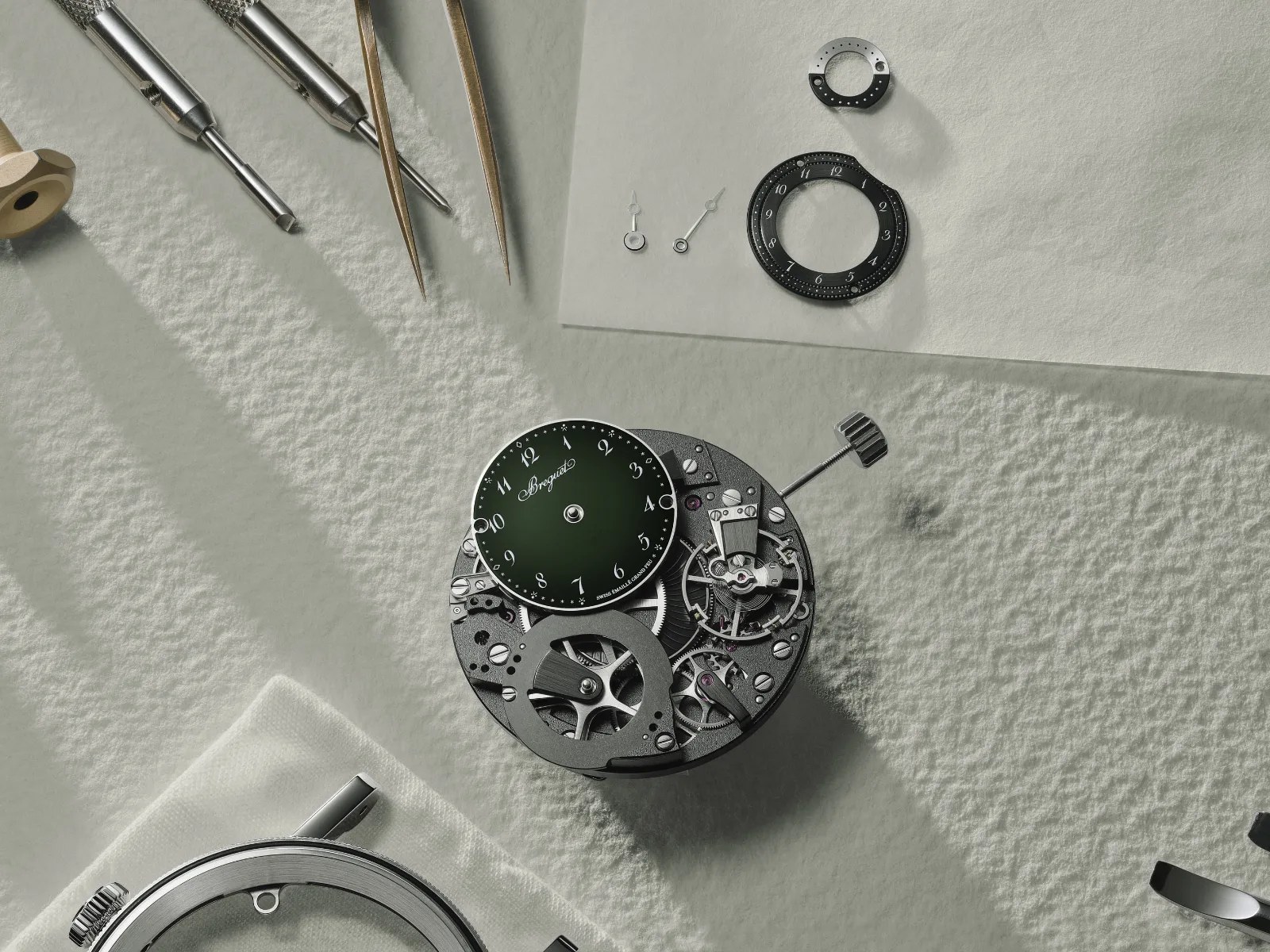
This is what separates a house with real depth from one that only appears to have it. When Breguet reaches for something contemporary, it keeps finding that the contemporary thing was already there, invented by the same man, two and a half centuries ago.
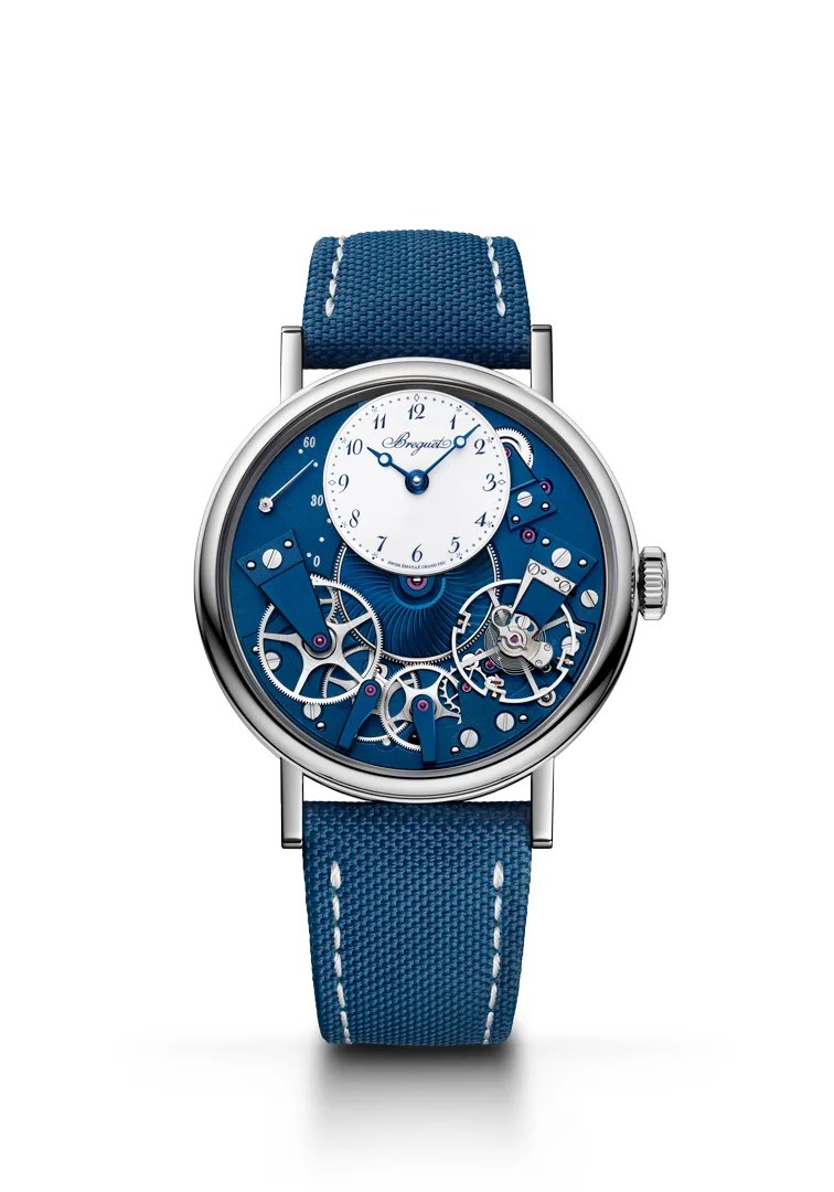
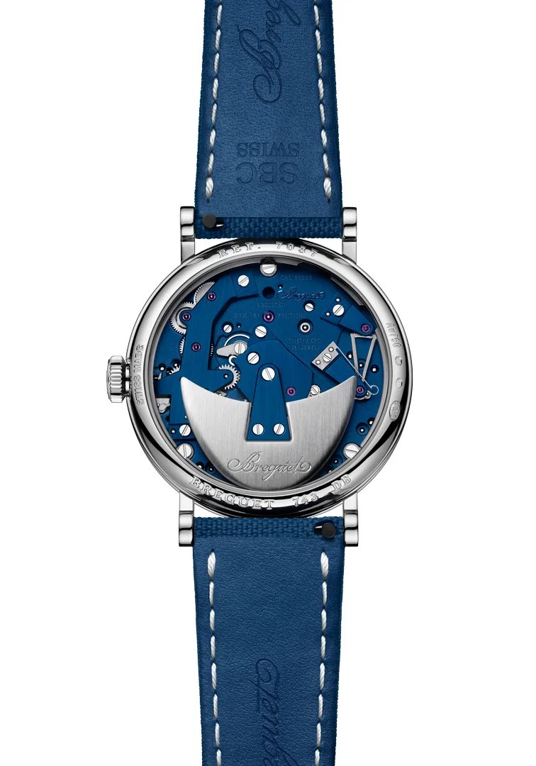
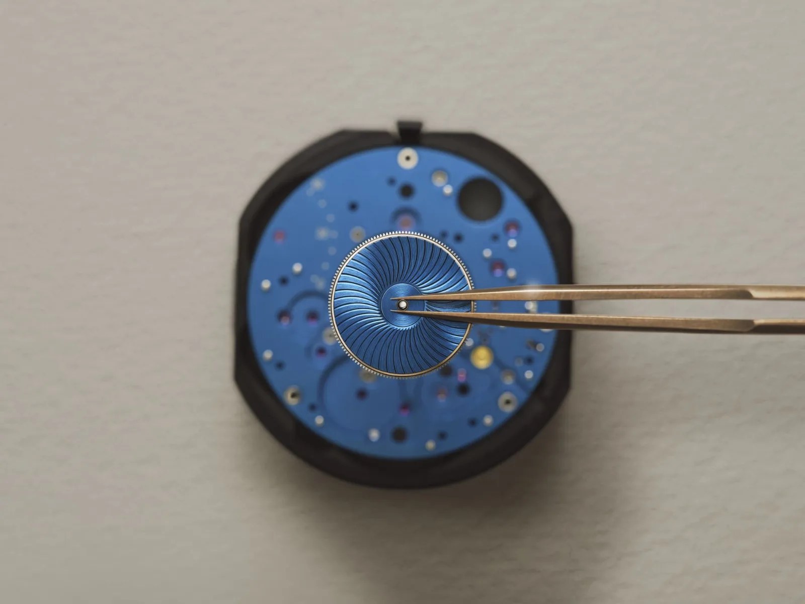
The 7037 makes that argument most plainly. Thirty-eight millimetres, white gold, two hands, a retrograde seconds indicator at ten o'clock. The movement is finished entirely in blue, the barrel cover hand-guilloché in a snailed pattern, all components hand-finished. The Grand Feu enamel subdial at twelve is immaculate white. It is, by any measure, a quiet watch. But quiet is not the same as simple. Every decision in it is load-bearing.
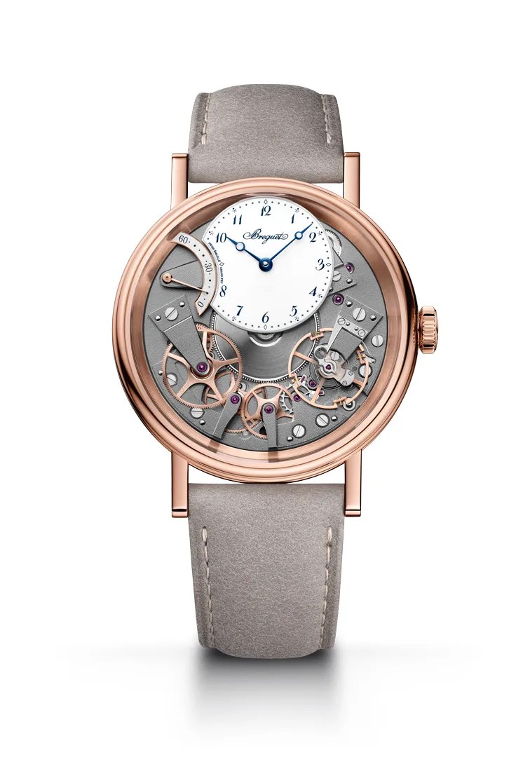
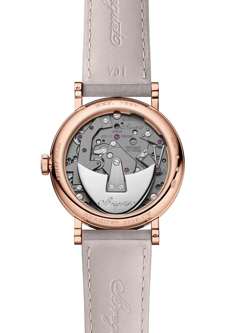
The 7097 takes similar principles into rose gold and pushes the visual contrast further. A white Grand Feu enamel dial sits against a new charcoal grey barrel cover, followed by a rose-gilt gear train, then the balance rim. Each component asserting its own colour and finish. The movement has always been the display on a Tradition, but here it reads more like something composed than assembled.
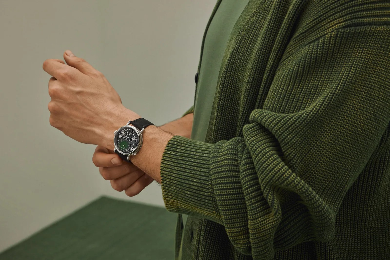
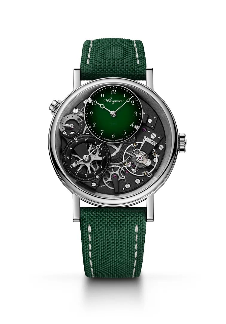
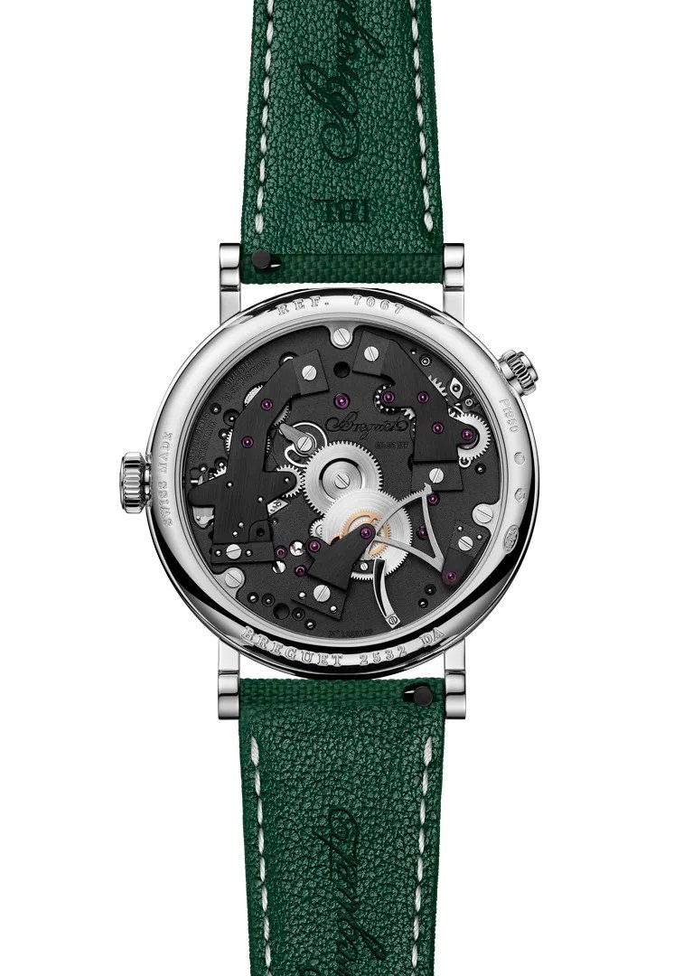
The 7067 GMT is the most layered of the group. The green-to-black gradient on the Grand Feu enamel dial is a significant technical feat, the firing temperature controlled to the exact degree for a transition that has no room for approximation. The dual-time display connects to Breguet's appointment as Watchmaker to the French Royal Navy in 1815, a role that required precision across latitudes. The home time subdial is available with Oriental numerals, reviving a direct historical practice of customisation for clients in the Ottoman Empire. That's not a regional marketing decision. That's a house drawing on its own archive.
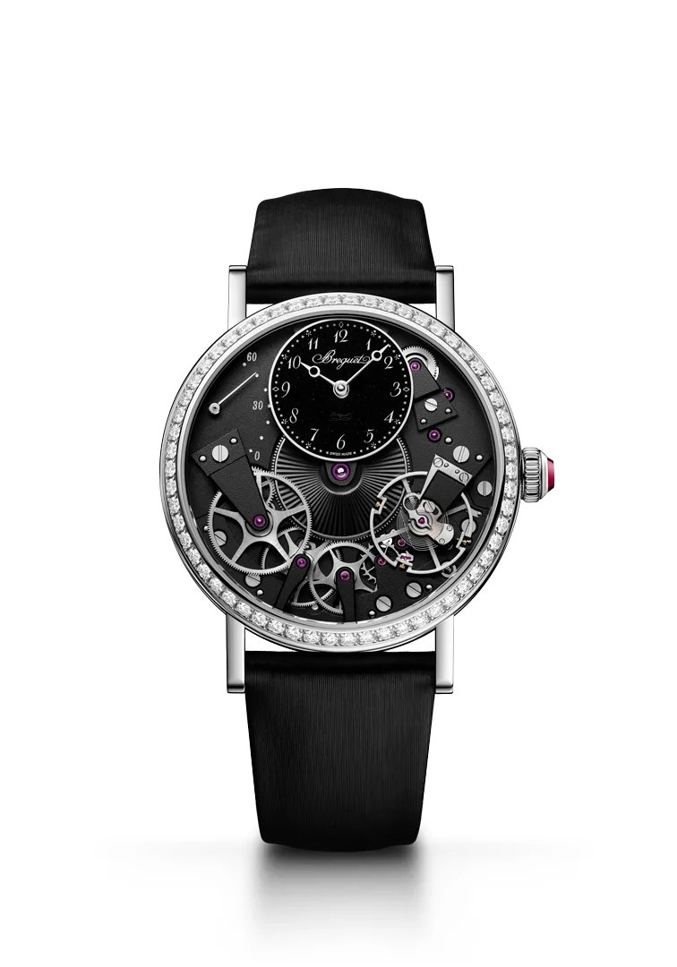
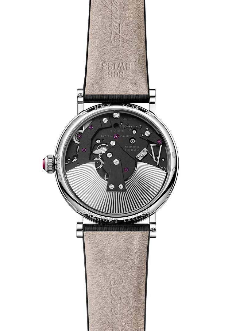
Then there is the 7038, which occupies a different register entirely. At 37mm in rhodium-plated white gold, with a bezel set with 58 brilliant-cut diamonds and a crown set with a watch jewel, it is the collection's most jewellery-forward expression. The dial is black aventurine glass, enlivened with silver-toned powdered transfers that create quiet depth without surface noise. A sunburst guilloché pattern covers the barrel cover and carries through to the oscillating weight on the caseback, creating a visual coherence between the two sides of the watch that rewards the kind of attention most people will never pay it. The mechanics underneath are unchanged: the same Calibre 505SR, the same 50-hour power reserve, the same retrograde seconds at ten o'clock. The point is that the Tradition's architecture is strong enough to hold this level of decoration without becoming something else. It remains, unmistakably, a Tradition.
The watches aren't the only thing being updated. Alongside the 2026 Tradition references, Breguet is introducing a new visual identity, a refinement of how the House presents itself to the world. The principles are consistent with the collection: not a departure from what came before, but a clearer articulation of it. Heritage as a starting point rather than a destination.

The deeper point across all four is this: the Tradition collection was always about visibility. Not transparency as a trend, but the genuine belief that a movement made to a certain standard deserves to be seen. What the 2026 references add is legibility. The contrasts are sharper, the materials more varied, the wearability more considered. The argument hasn't changed. It's just being made more clearly.
Abraham-Louis Breguet spent his career advancing his art while remaining faithful to the principles behind it. The Tradition collection, two decades in, is doing exactly the same thing.